.svg)
Summary
Mission
ShipStation faced a conversion challenge rooted in one critical moment: a merchant successfully creating their first shipping label and how long it took to get there. New merchants were reaching the product with high intent, but setup friction (configuring Ship From, connecting a store, adding a payment method, and navigating "what do I do next?" moments) was creating confusion, slowing activation, and pushing merchants toward Support and Sales before they'd ever shipped anything.
One internal insight made the stakes clear: 75% of ideal customers who print a first label convert. Only 9% convert without printing. First label wasn't just a milestone, it was the clearest predictor of revenue.
My Contributions
As Lead Product Designer, I was the single design thread through a multi-quarter initiative that spanned two CPOs, multiple PM transitions, and a significant pivot in onboarding strategy. Through each change, I kept the team anchored to the same outcome: help merchants get to their first label faster.
I led the end-to-end First Time Use (FTU) experience focusing on three facets:
- The Homepage (first landing): where new merchants arrive and are directed to the next best action
- The Guided Onboarding Wizard (core deliverable): a structured setup flow that gathers the minimum required information to ship
- A “To-Do” model (drip enablement): deferred tasks that continue setup and feature adoption without overwhelming day-one onboarding
I partnered daily with Product and Engineering on feasibility, scope, and sequencing. I collaborated with Customer Success to keep the work grounded in real friction. And I brought in other designers for critique and support as work expanded.
Impact
This project used experimentation to reduce friction in the path to shipping and strengthen early activation signals particularly by improving rate discovery and simplifying early setup decisions.
- Onboarding completion rate improved 31%
- Support tickets decreased by over 40%
- 57% of new users successfully purchased a label within the first week.
Design Process
Discovery
I started by building a shared understanding of where merchants were losing confidence on the path to first label. I aligned across multiple inputs:
- Funnel and core action analysis to identify where trial users slowed down or stopped — tracking Trial Signup → Store Connection → First Order → First Print → Credit Card Entry as the primary conversion spine
- Support and Customer Success themes to understand which setup moments were generating the most tickets and hand-holding
- Qualitative user interviews (14 sessions covering Signup → Progressive Disclosure → Homepage) to observe real-world confusion, hesitation, and unmet expectations
- Competitive benchmarking against Veeqo, Shippo, Pirate Ship, EasyShip, and ShipHero to map how competitors reduce steps to a first label purchase
What came back was consistent: merchants weren't confused about whether to use ShipStation, they were confused about where to start and what the product was designed to do. User quotes from research made it human:
"I had thought I'd have it up and running faster." "I finally got a customer support to come in and they got it done in ten minutes. That's what we should have done from the beginning."
The decision I led: stop trying to teach everything upfront. Align onboarding around the minimum required to ship, with deeper configuration handled progressively after first-label success.
Tradeoff I named: reducing early flexibility risked feeling restrictive, especially for experienced merchants. We accepted that tradeoff deliberately, with a plan to reintroduce flexibility after the activation milestone was reached.
Defining the Structure
The most important inflection point in this project wasn't a design decision, it was a strategic one, and navigating it was where my leadership mattered most.
What changed: Midway through the initiative, executive leadership transitioned. Where the previous CPO had shaped a more self-directed onboarding model, multiple entry points, flexible configuration, user autonomy from the start, the new CPO reframed the direction: elevate Rate Shopper as a strategic differentiator, reduce steps, create teaching moments, and move merchants to first-label success faster.
The concept changed. The mental model changed. The entry point changed. Feature exposure timing changed.
How I led through it: I didn't restart the work. I used what research had already proven, merchants were overwhelmed, uncertain where to start, and needed clearer "next right step" guidance, and mapped those findings to the new strategic direction. The friction was the same. The solution now had a sharper frame.
I aligned the team around a single design principle:
Reduce early branching to lower cognitive load, then reintroduce flexibility once merchants have momentum.
That became the architecture for the new FTU system:
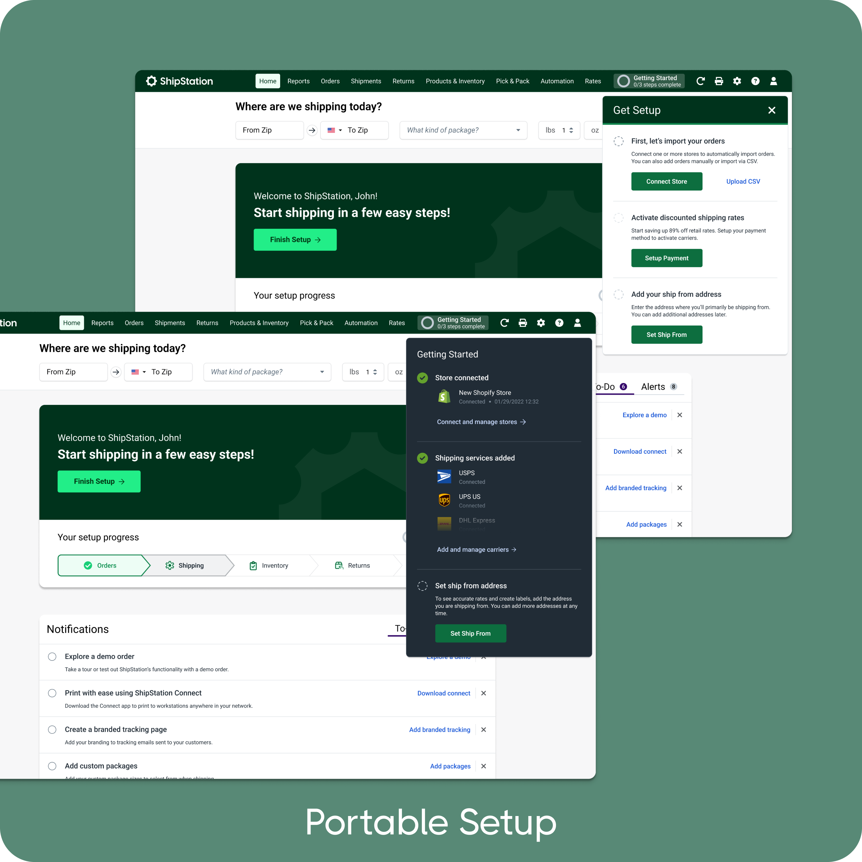
1. Homepage New merchants land on the homepage first. I structured the hierarchy and messaging to make the “next right step” obvious and reduce wandering.
2. Setup Wizard The Wizard became the primary path for gathering critical setup information through clear, sequential steps:
- Add Ship From location
- Connect store(s)
- Add a payment method
- Optional: Inventory setup
- Optional: Returns setup
3. To-Do I helped shape a “do later” model where optional tasks aren’t forced into the core onboarding path. Deferred items are captured and surfaced as To-Do tasks, helping merchants continue configuration over time without blocking early success.
Tradeoff: guiding users step-by-step increases completion and clarity, but requires careful “skip/resume/do later” handling so experienced users don’t feel trapped.
.png)
Wireframes
In low fidelity, I validated the connected system: Homepage → Wizard → To-Do — before committing to UI direction.
My focus in wireframes was on three structural questions:
- Wizard: what are the minimum required steps, and how do we handle skip, resume, and "do later" without creating confusion?
- Homepage: how do we establish hierarchy that prioritizes action over passive resources, especially on first login?
- To-Do: how do deferred tasks get surfaced, completed, and dismissed without creating guilt-driven checklists?
Solutions I considered and why I chose the Wizard approach:
A full-page linear onboarding flow was faster to build but required merchants to complete everything before reaching any value. A highly flexible self-directed model preserved autonomy but reproduced the same "where do I start?" confusion we were solving for. The Wizard approach, structured enough to guide, flexible enough to skip, was the right balance given the research and the strategic direction.
.png)
UI Design
With structure validated, I moved into high-fidelity UI with three clear priorities:
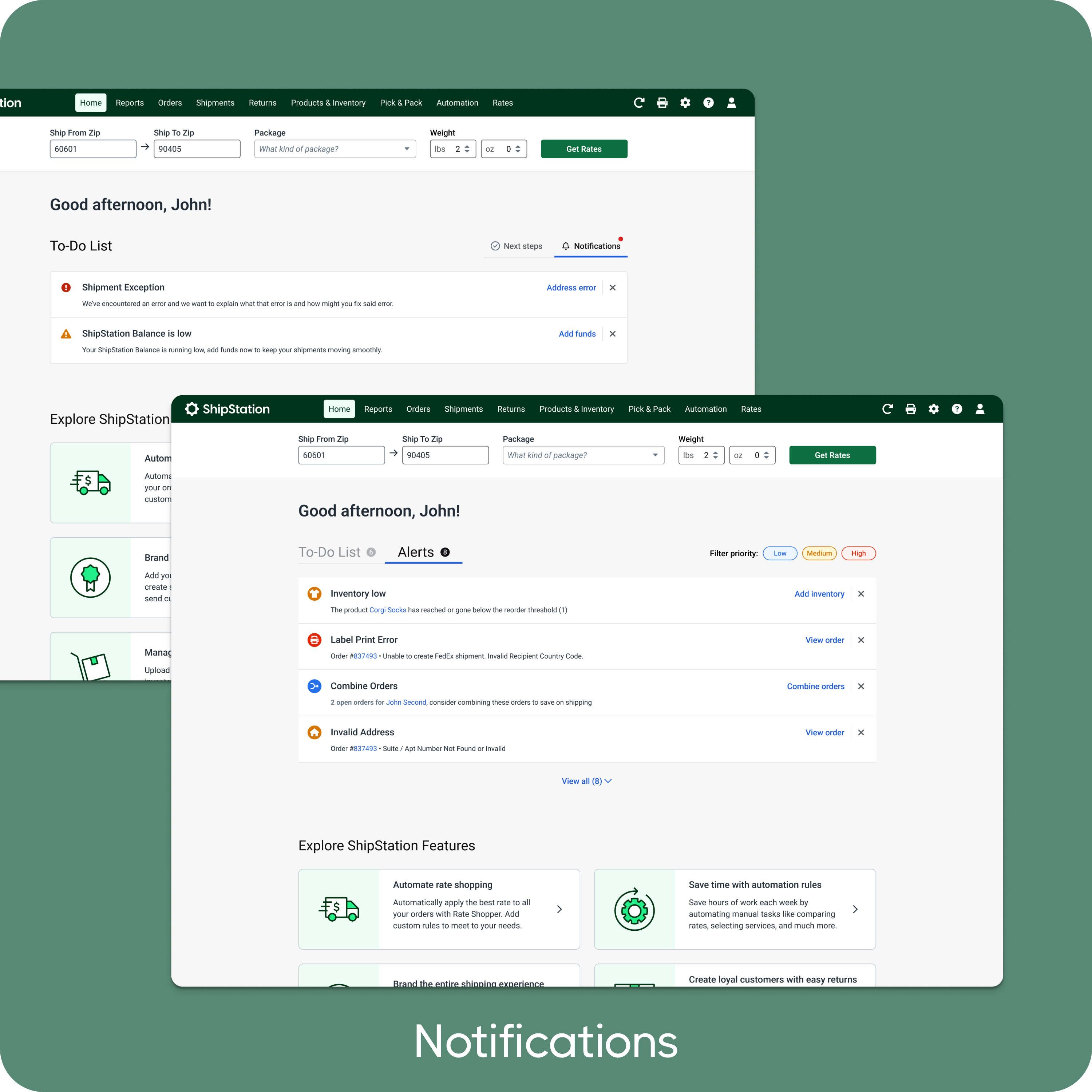
1. Homepage: action-first, scannable from top I designed the hierarchy so that new merchants see their most important next step immediately, not a welcome banner, not a resource feed, not a list of features. The setup prompt is primary. Everything else is secondary.
2. Wizard: lightweight, not bureaucratic Teaching moments are short and contextual. Progress is visible. Each step has a clear purpose, a clear completion state, and a clear path forward. I reduced copy at every iteration, consistently advocating for less instruction and more confidence-building through the interface itself.
3. To-Do: optional but purposeful Tasks are framed around value ("Set up your label layout so every shipment looks professional") rather than completion anxiety. Merchants can remove or dismiss tasks. The model is designed to pull people forward, not nag them.
The tradeoff I held throughout: simplification vs. platform depth. ShipStation is a powerful tool. I consistently pushed to protect the first-time experience from that complexity without hiding it from users who were ready for it.
.png)
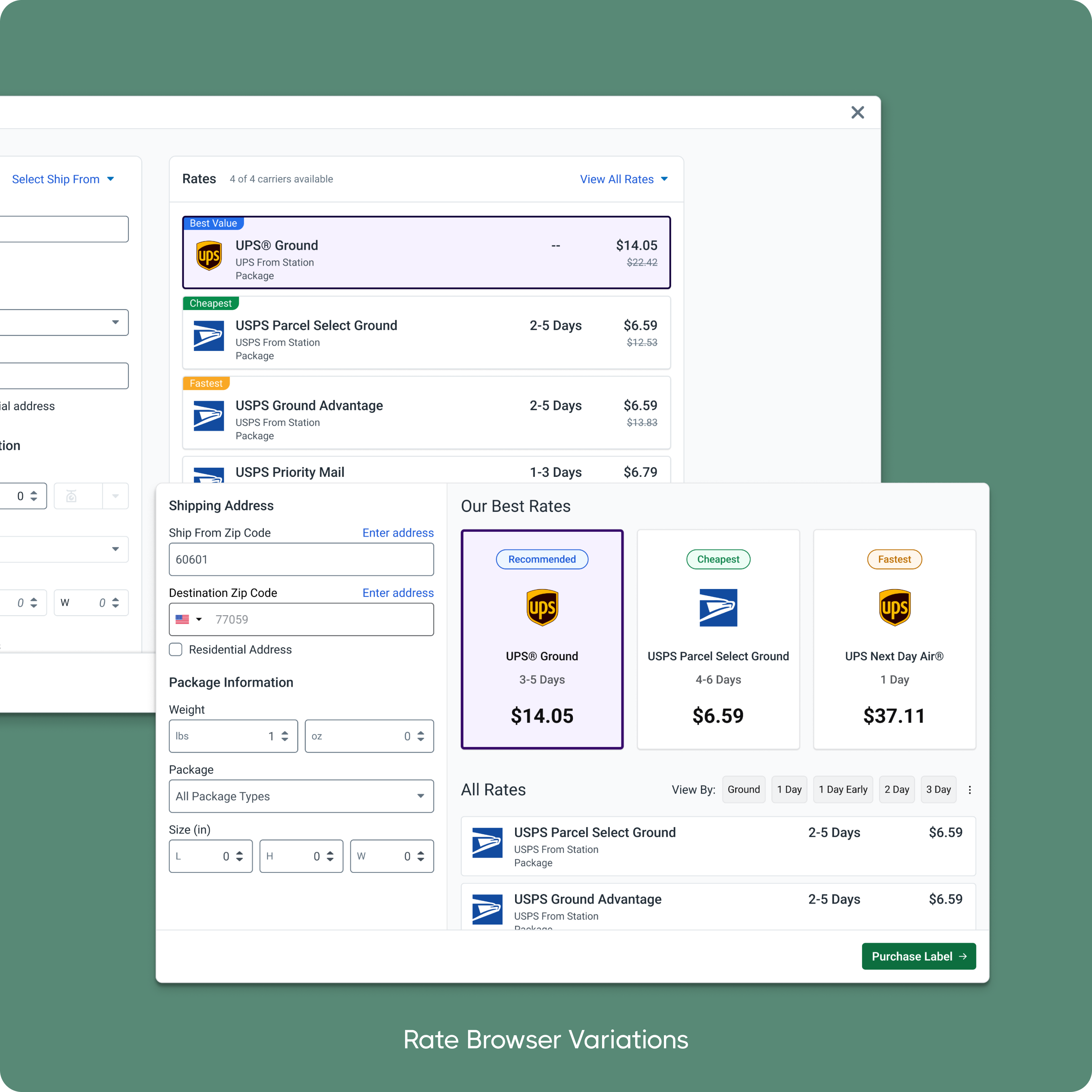
Rate Browser Redesign
Rate browsing was both a high-impact activation pathway and a design challenge: it's a feature with real power-user depth, but that same depth created friction for first-time merchants.
I led a redesign focused on reducing required inputs to the minimum needed to generate useful rates, improving scan-ability of rate results, and using progressive disclosure to keep advanced carrier and package options available without cluttering the primary path.
The pre-populated Rate Browser experiment on first login became a clear winner: +12.41% lift to day-one shipping, ~1% conversion lift. That result validated the hypothesis that showing rate value early, with minimal friction, moved merchants meaningfully closer to first label.
Decision I led: prioritize simplicity in the default view, depth via expandable options. This pattern also became reusable scaffolding for other input-heavy flows in the product.
.png)
Testing
I created interactive prototypes in Figma and conducted usability testing with 15 new users. Key insights from these sessions directly shaped the final solution:
- Progressive disclosure increased confidence by breaking onboarding into digestible steps
- Reducing steps from 8 to 5 improved flow completion without removing critical functionality
- Simplified copy and inline error prevention reduced support dependency
- Smart defaults and contextual tooltips helped non-technical users navigate integrations
This data-driven iteration cycle ensured that every design decision was validated before development.
Handoff
I led design-to-engineering handoff with clear specs, states, and edge-case documentation, especially critical given the cross-team dependencies and evolving ownership throughout the initiative.
I worked with Engineering to sequence work around platform constraints (payments/wallet dependencies, carrier terms alignment), define MVP scope that protected the first-label path, and QA critical states, including setup recovery patterns, payment failures, and carrier connection clarity.
I also maintained active feedback loops with Customer Success post-release, identifying where guidance still fell short and where friction was generating new tickets.
.png)
Impact
The final system reframed onboarding from "learn everything" to "ship successfully" with Homepage, Wizard, and To-Do working together as a connected activation system rather than disconnected UI improvements.
This project demonstrates how I work as a Lead Product Designer:
- Leading through change: strategy and ownership shifted across two CPOs and multiple PM transitions. I maintained continuity by keeping the team anchored to first label as the north star, and translated new strategic direction into a coherent, testable product experience.
- Making decisions with evidence: we shipped experiments, used guardrails, stopped what wasn't working, and iterated with clear hypotheses, not opinions.
- Cross-functional partnership: I aligned Product, Engineering, and Customer-facing teams on the journey, sequencing, and what we could ship under real constraints.
- Championing merchant clarity: my consistent pushback throughout was on cognitive load, simpler copy, fewer steps, more obvious next actions. Every time complexity crept back in, I brought it back to the merchant's first five minutes.
.png)
.png)