.svg)
Summary
Mission
As ShippingEasy continued to grow, we faced a common but critical challenge: there were too many workflows leading to just a few core outcomes—batch creation, label generation, and rate comparison. This created confusion, poor adoption, and an influx of support tickets. The goal was clear: improve merchant onboarding and day-to-day usability by creating streamlined, consistent workflows and a new cross-functional rate browsing experience.
My Contributions
As the lead designer on this initiative, I worked closely with two product managers and engineering partners from the earliest research stages through to final implementation. I led discovery, user research, and usability testing efforts, collaborated with a fellow designer to co-create scalable UI components, and helped define the product roadmap to align feature releases with key business goals. I also championed merchant needs across teams to ensure that both the workflows and rate browsing experience served our users effectively while meeting business objectives.
Design Process
Discovery and Research
We began with a quote that echoed across multiple merchant interviews:
"There are too many ways to do the same thing, and none of them feel easy."
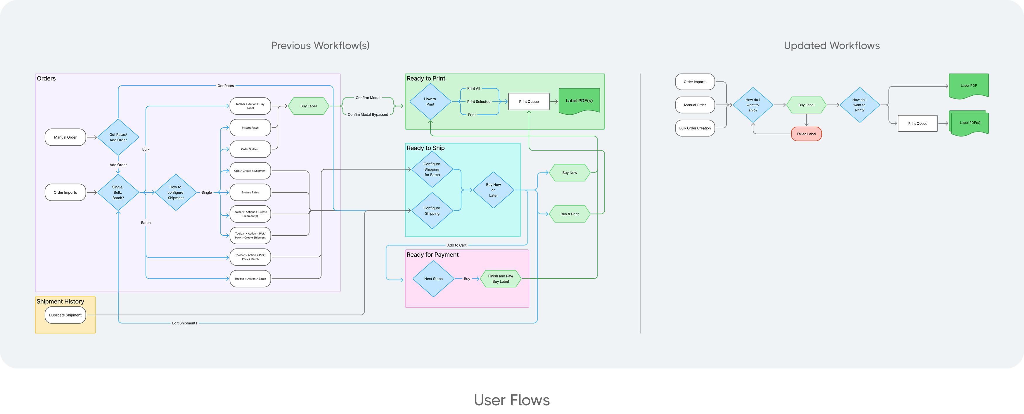
We validated this through NPS feedback, merchant surveys, and over 1,500 monthly support tickets. The data confirmed what merchants and internal teams had long suspected: there were 14 different paths to accomplish just three core tasks, causing unnecessary confusion and inefficiencies.
To dig deeper, I led qualitative interviews with merchants and collaborated with our customer support team to understand both user and operational pain points. Our research goals focused on:
- Identifying friction within current workflows
- Understanding how to improve the label buying and rate comparison experience
Defining the Problem
From the research, we identified that merchants needed:
- More identifiable and consistent workflows
- A simplified rate browsing experience
These problems impacted both new user activation and long-term retention. Internally, this misalignment drove up support tickets and made it harder to maintain consistency within our design system, slowing down iteration and cross-team alignment.
Ideation and Workflow Design
We framed the challenge as: How might we simplify and streamline merchant workflows while improving the rate shopping experience?
Using FigJam and Lucidchart, I facilitated remote design jams that brought together product managers, engineers, and fellow designers. This cross-functional collaboration ensured we aligned on both the customer journey and technical feasibility.
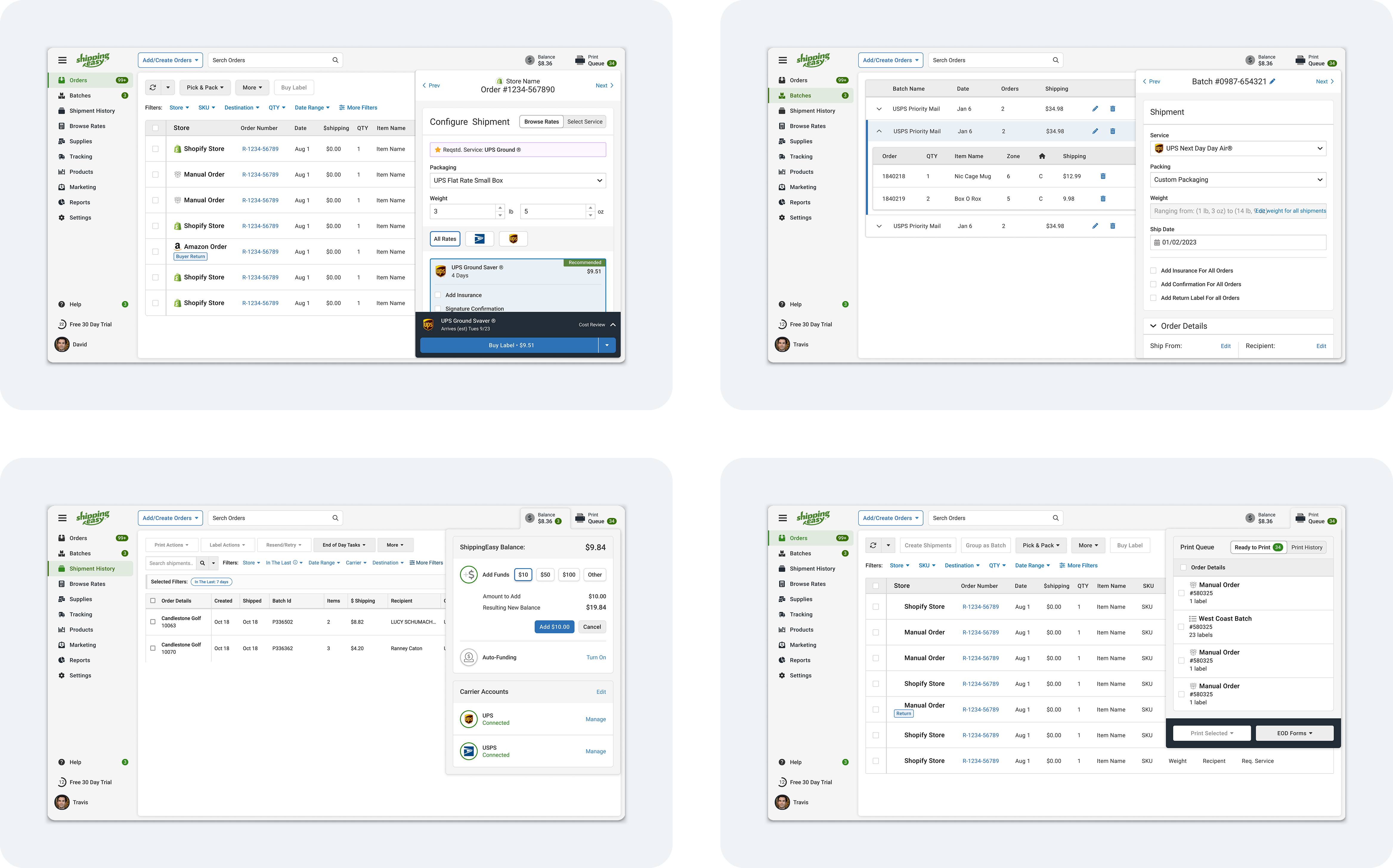
We mapped new batch creation and label configuration flows that reduced redundancy and improved clarity. These became the foundation for our updated information architecture and UI.
.png)
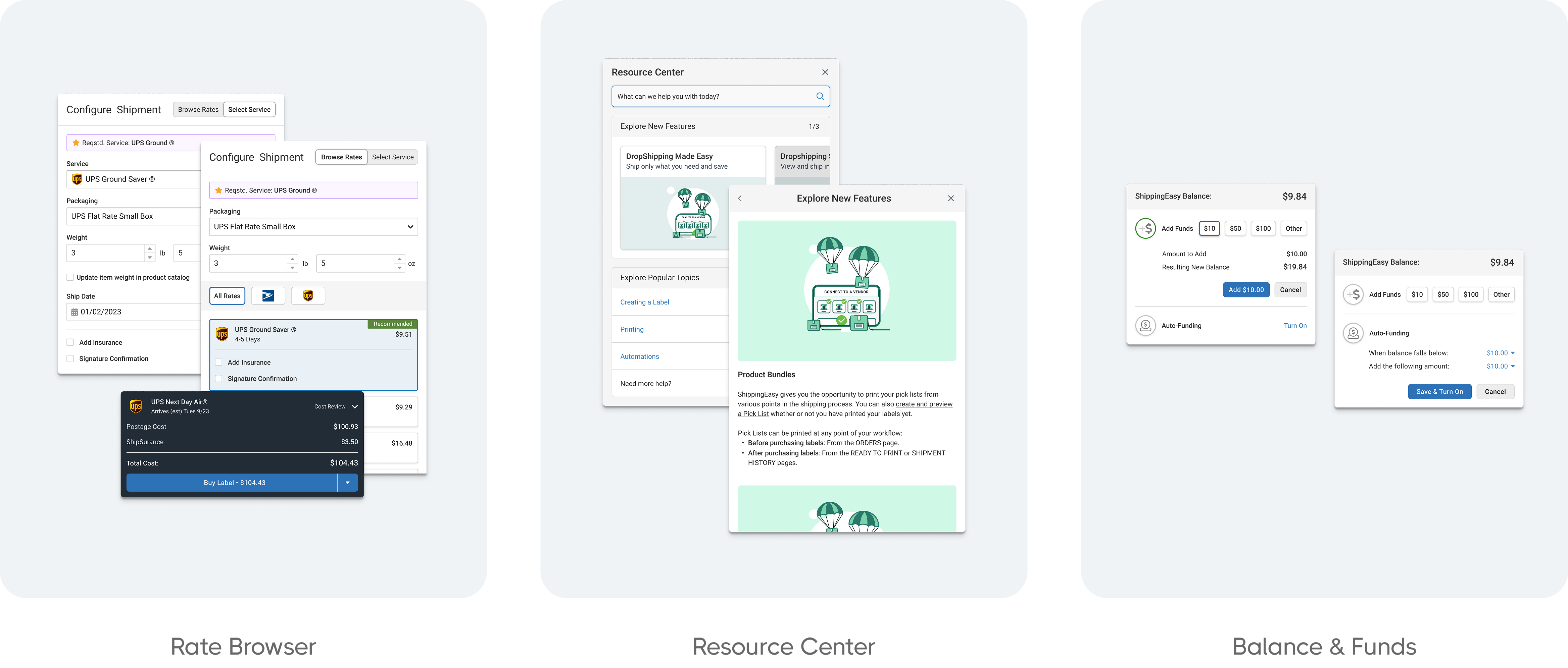
Designing a Cross-Functional Rate Browser
A critical focus of this initiative was the redesign of the rate browsing experience. I partnered with another designer and worked closely with engineers to create a reusable component that could be implemented across multiple brands within our ecosystem.
The goal was to help merchants quickly compare rates and select the best option without friction. To do this, we:
- Reduced the number of inputs needed to generate results
- Designed a streamlined display of rates with clear prioritization
- Built a scalable UI component to be used across products with minimal customization
Testing and Iteration
Once we had updated workflows and a new rate browser in place, we ran two rounds of moderated usability testing with current merchants. Their feedback helped us:
- Refine the logic of batch creation and label setup
- Identify and fix gaps in the rate comparison interface
Following design validation, we implemented the changes in phases to reduce disruption. We monitored user behavior, survey feedback, and support data in real time to ensure a smooth rollout.
Results and Reflections
After launch, we saw a notable improvement in both activation and customer satisfaction:
- Activation increased from 20 percent to over 30 percent
- Support tickets dropped from 1,500 per month to under 800
This also contributed to a smoother onboarding experience, reduced training time for new users, and created a more cohesive product ecosystem that could scale more effectively with future releases.
Looking back, this project highlighted the power of cross-functional design and deep research. By balancing business needs with user insight, we created an experience that delivered value to merchants while setting a new standard for our internal design process.
We continue to iterate on these improvements, using feedback loops and additional testing to build toward an even better product experience.
