.svg)
Mission
Create a fully remote, end-to-end telehealth experience for patients and physicians, designed to be mobile-first and scalable enough to support future white-labeled clients like The Mayo Clinic.
What began as a platform for sharing STD status and booking local testing evolved into a robust digital healthcare solution: a platform for remote diagnostics, telehealth appointments, EMR review, and vaccination tracking.
Discovery & Strategy
Brought in during a period of rapid growth, I worked closely with the founder and engineering team to identify key product gaps and opportunities for scale. We aligned on a vision to evolve SAFE into a comprehensive telehealth platform while maintaining a lean, agile design process.
Early challenges included:
- Designing for both physicians and patients, each with unique workflows and technical familiarity
- Building custom tools from scratch due to limited funding (including our own EMR)
- Ensuring everything could be mobile-first and easily white-labeled for future partners
I collaborated with in-house physicians to understand diagnostic workflows, pain points with current EMR systems, and mobile usage patterns. These insights became the backbone for our design decisions.
IA & User Flows
Given the complexity of healthcare data and compliance needs, we prioritized the information architecture early. I led the design of:
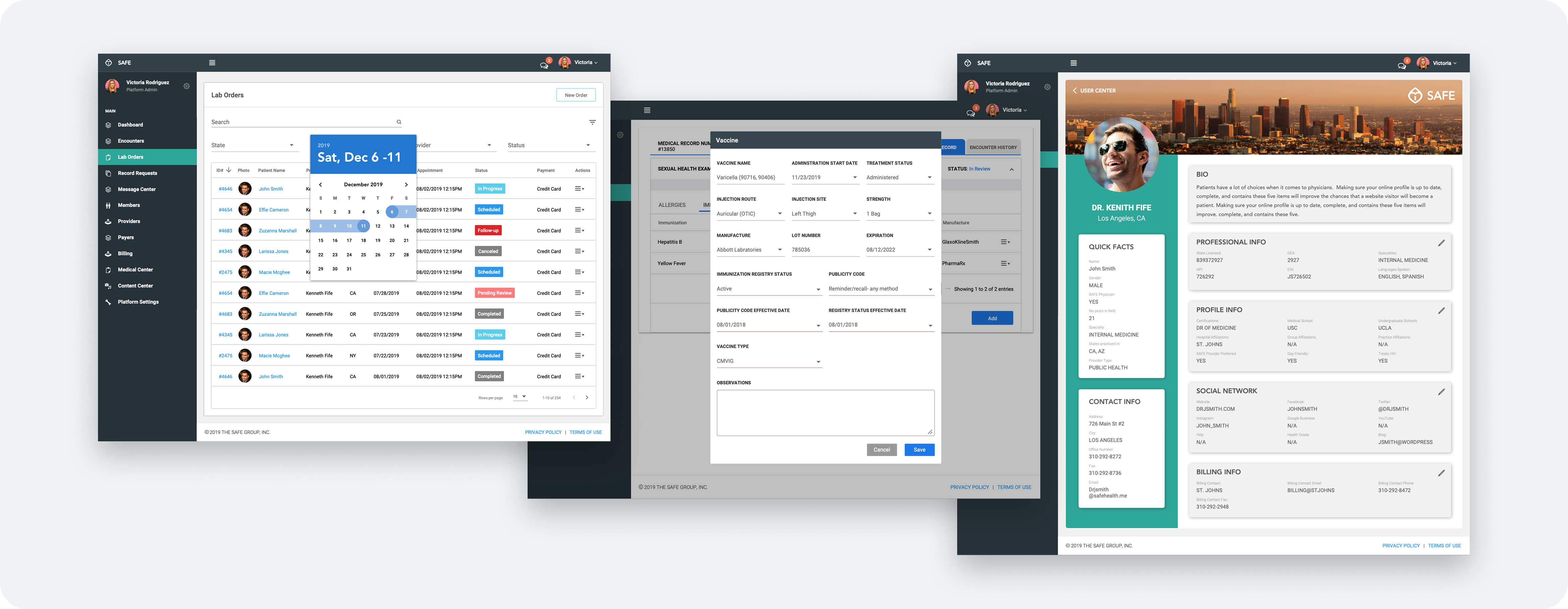
- A custom EMR system tailored to SAFE's diagnostic and telehealth needs
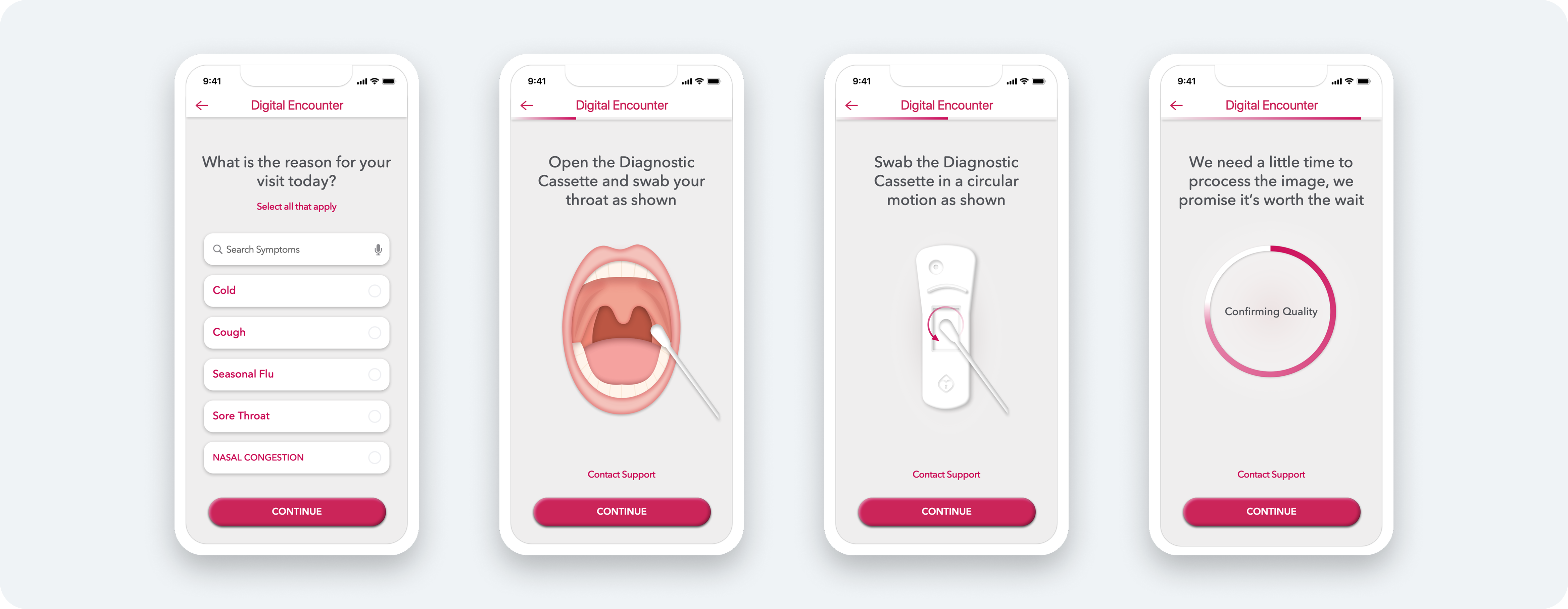
- Patient intake questionnaires and home testing flows for mobile
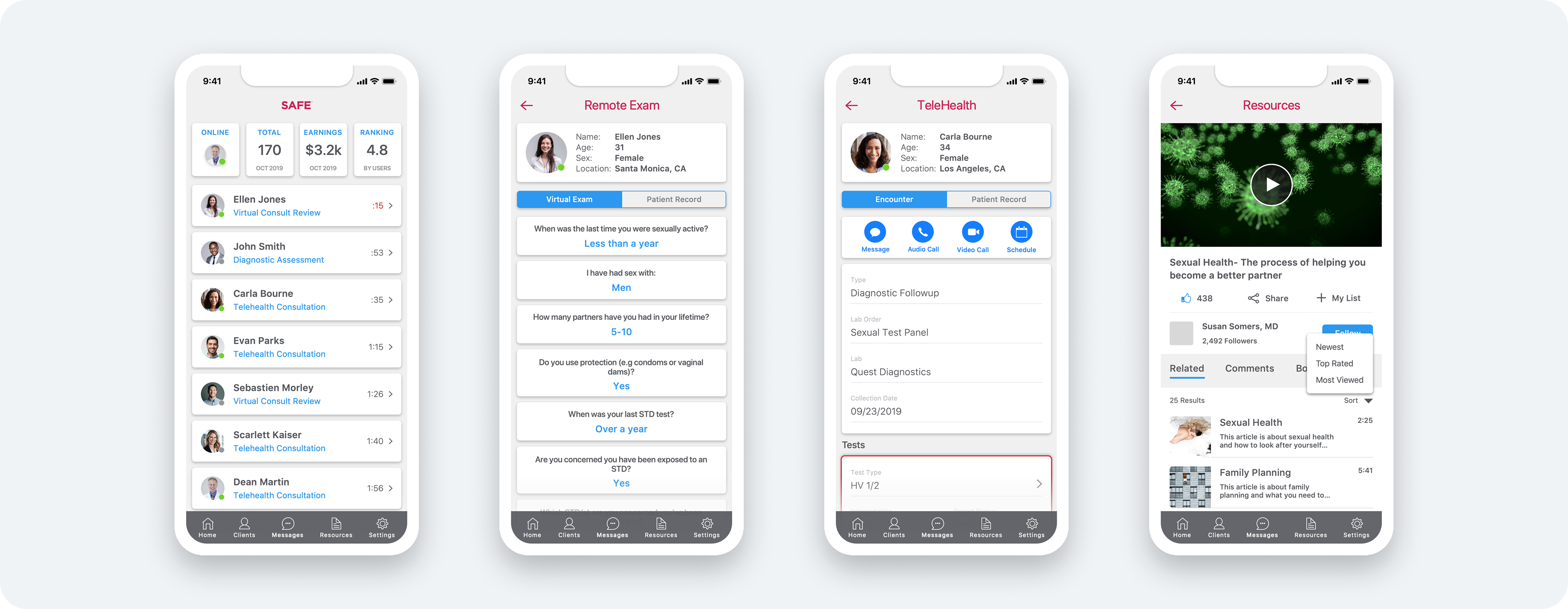
- Telehealth-ready physician dashboards with record review and appointment setting
We borrowed familiar patterns from leading EMR platforms to ensure rapid adoption and ease of use, validating early flows in working sessions with practicing physicians.
UI Design & Mobile Experience
With brand guidelines in place, I moved quickly into UI execution, emphasizing simplicity, clarity, and mobile usability. The UI aimed to:
- Reduce keyboard usage to minimize friction on mobile
- Use progressive disclosure to avoid overwhelming users
- Support both desktop workflows (physician console) and mobile tools (for on-the-go reviews and scheduling)
A key shift was designing a mobile experience for physicians, an idea that grew out of testing feedback and ultimately allowed doctors to manage care and conduct virtual appointments from their phones.
Iteration & Feature Expansion
SAFE wasn’t just designed to function, it was built to evolve. As we neared the end of our core redesign, we introduced new features to strengthen both the patient and physician experience:
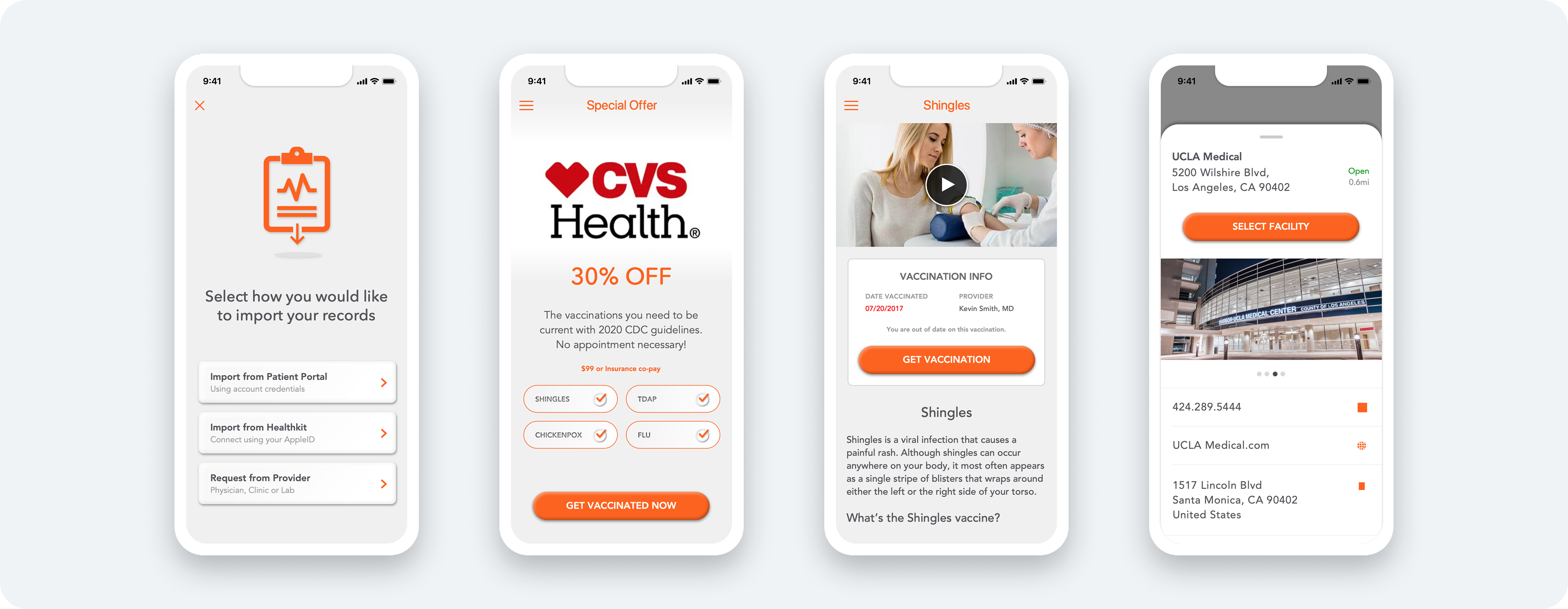
- Gamification and feedback loops for patients after each appointment
- White-labeled functionality to support partners like The Mayo Clinic
- Designed and prototyped VAXI, a vaccination tracking app based on CDC guidelines in collaboration with Mayo Clinic physicians
These features not only expanded our value proposition but proved the design system could flex across use cases.
Results & Reflections
After multiple design-engineering sprints, the SAFE platform was launched publicly. Within weeks, we saw:
- Organic adoption increase as marketing scaled
- New physician partners onboard successfully through our mobile onboarding flow
- A major health system (Mayo Clinic) express confidence in the product’s flexibility by adopting a white-labeled version
Reflections:
Designing in a lean startup came with trade-offs, I often wished for more time to test and iterate. Still, the fast pace sharpened my decision-making and allowed me to lead with clarity. I walked away from this project not only proud of the product we shipped but of the strong cross-functional collaboration that made it possible.
